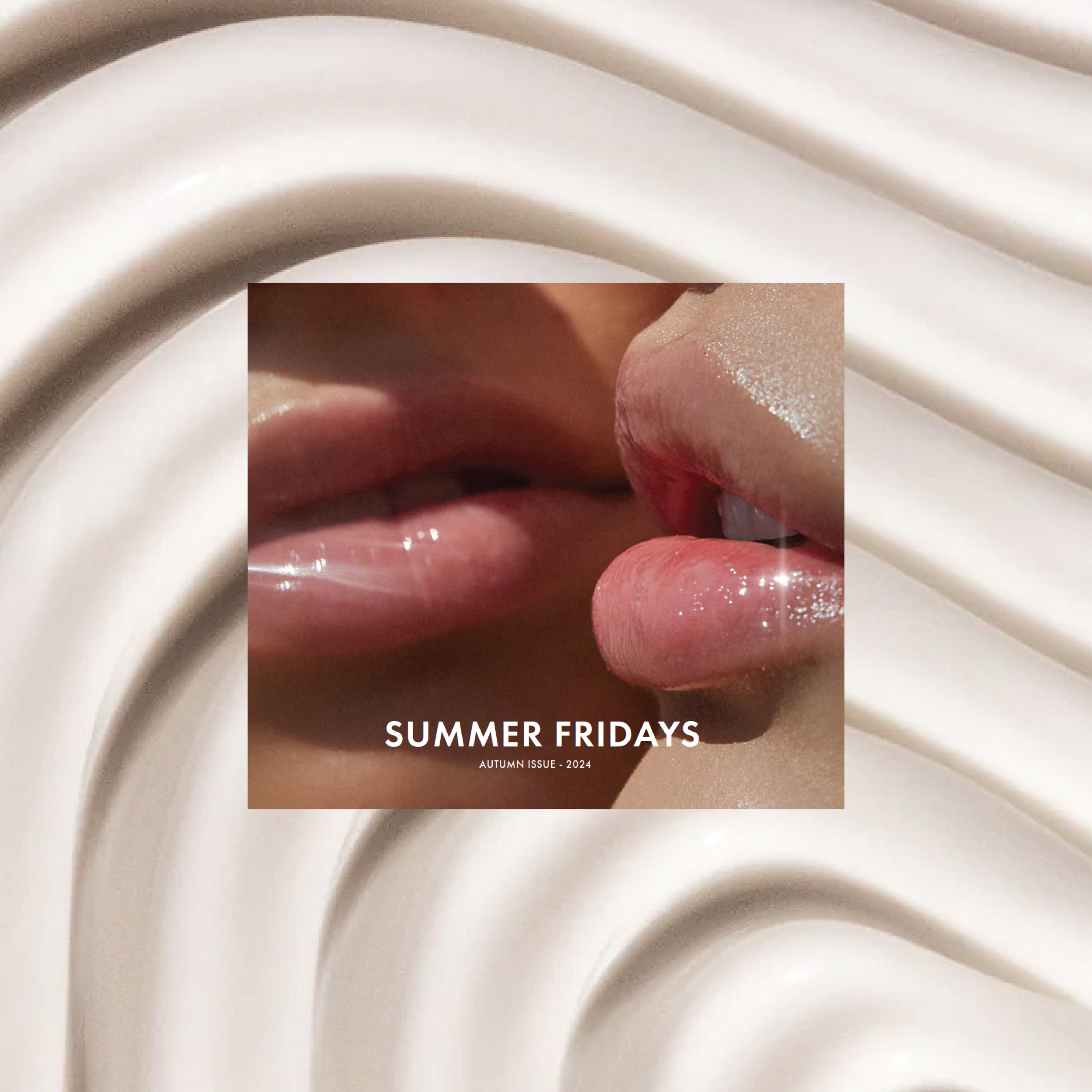
SUMMER FRIDAYS CATALOG
Creating my 12-page Summer Fridays product catalog was all about translating the brand’s clean, modern aesthetic into a tactile, editorial experience. I wanted every page to feel intentional—light, airy, and reflective of the effortless beauty that Summer Fridays represents.
The design process started with our color palette: soft neutrals, sun-washed tones, and calming shades that echo our product packaging and overall brand vibe. Typography was key too—elegant yet minimal fonts that allow the product stories and images to take center stage. I opted for generous white space and a layout that feels breathable and easy to navigate, just like our skincare routines. Using a grid structure on Adobe InDesign and images from Summer Fridays’ website I present my Autumn Issue.
DELIVERABLES
-
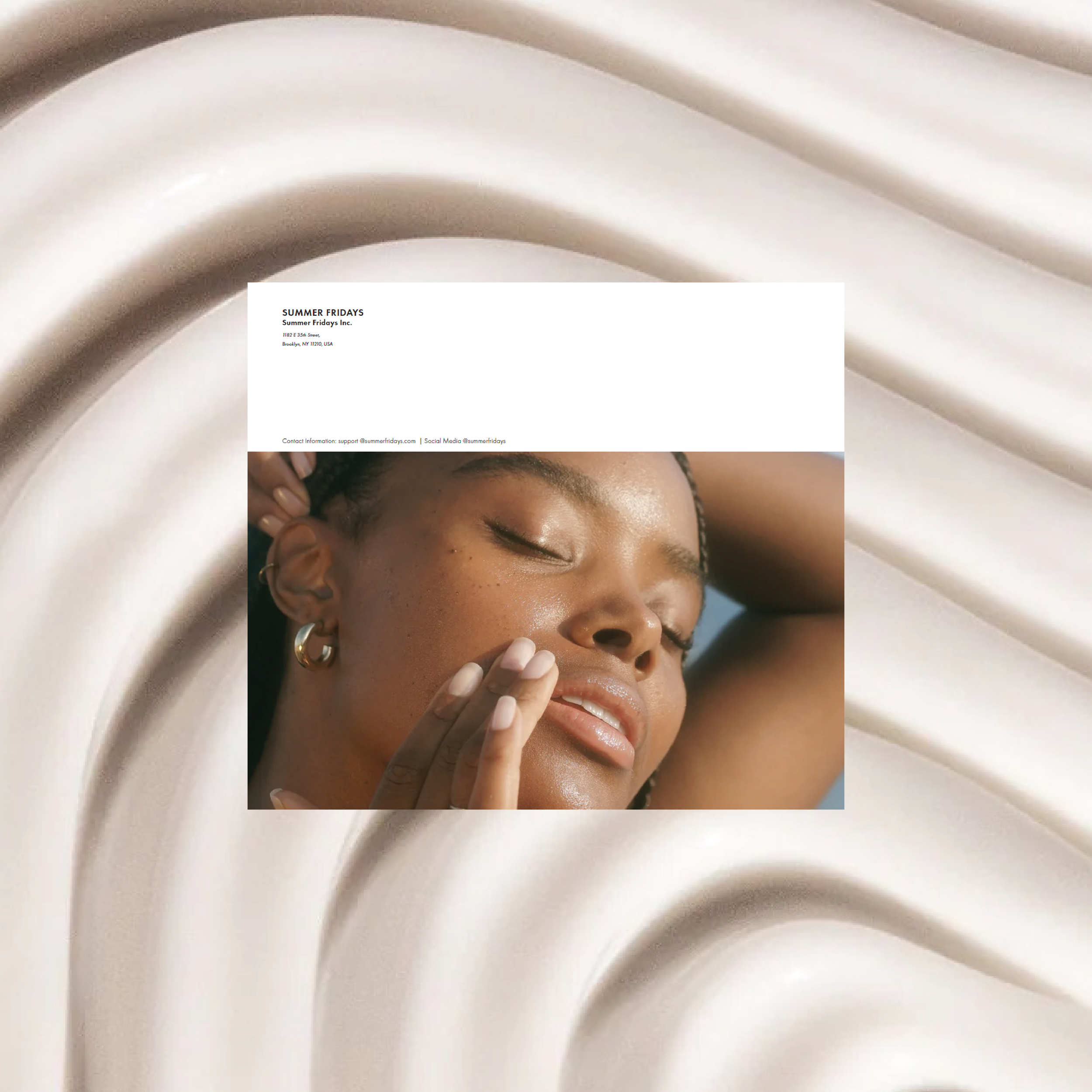
a catalog that not only informs, but inspires—a piece that feels just as beautiful on a coffee table as it does functional as a shopping guide.